
Color Space vs. Color Gamut Explained through Real-World Examples
What’s going on Qaznation! In today’s video we are covering a pretty confusing topic for beginners and non-colorists: color space vs. color gamut.

Those are the topics I will be covering, so grab a notepad and let’s get this going.
So the first thing we are going to be covering is what color space is. This is a range of colors inside a color spectrum that is visible to the human eye.

So here are a few examples of color spaces. You can see the amount of colors that each color space covers within the spectrum. Some are going past that, which is perfect for archival.
Now, the second thing is what is color gamut? Color gamut is a range of colors within the color space that can be reproduced on an output device.

You can see the color spaces are a lot wider than our color gamuts. But that’s the point.
So now, what is the difference? To further explain the difference is to hop into resolve.

You can see that the input transform has ACEScct as our input transform.

If we change the output from rec.709 to P3-D65 ST2084 (1000 nits), then this is what we get.

Our image looks like this because we are choked on the display level. My display can only output rec.709, so it’s sort of blind to what this color space/gamut is. My color space and gamut can be as wide as possible, but we are limited to what our display can output.
So why is this all important? So here is a practical explanation. Let’s say that I am grading on the left monitor.
This is the Apple Pro Display XDR and it’s set to P3 color space by default. So even though my whole color space and gamut is set to rec.709, what you’ll see is the screen on the right.

There might be some color shift, but the overall image is going to look like that compared to the screen on the right. But I am going to show you how to fix that.
So we are now going over how to properly set up color space & color gamut. The first thing I do is change my screen mode to rec.709.


Now if you see the screens, they look a lot more similar. But let’s go even further. Let’s say the client asks for HDR. So I select the right parameters for that, and apply them.


As soon as we do that, this happens. We know that HDR and dolby vision is supposed to look lifelike and pop. It shouldn’t look like this. But the problem is our screens and displays are still set to output rec.709. Meaning we need to tell our screens that are capable of outputting HDR, to do that. So my Sony monitor can do that and I will switch it to be able to read that.

This is why it’s important to know these things, so that we can know what to look for.
So naturally the next step is knowing what to look for in a monitor when using a specific color gamut. Now I’ve picked out three different monitors at three different tiers. So starting at the getting serious tier, I highly recommend a monitor like this (picture below)
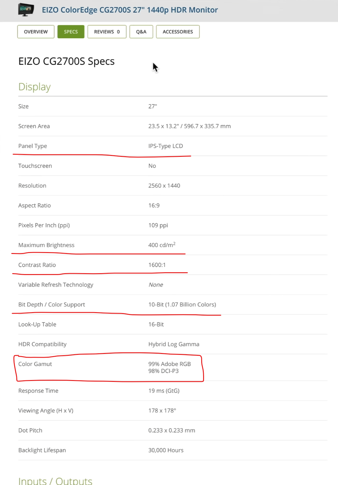
This monitor is perfect for rec.709 at 400 nits, and has a good contrast ratio for the IPS panel. Plus it covers 100% rec.709 (which is why it’s not mentioned).
The second example is going to be a professional monitor when it comes to SDR grading. This is the Flanders Scientific DM241.

Now it’s a 10-bit panel, with 1100:1 contrast ratio but because it’s a wide gamut LED panel, it’ll feel like the same contrast ratio as the Eizo. This goes to 450 nits though. Then it tells you it covers 100% rec.709 and DCI P3.
Then finally, when you’re a baller you can get the Sony BVM-HX310. This is perfecto when it comes to grading top end stuff. As of now it doesn’t get any better than this.

It has 1000 nits sustained, which is good for HDR. It has 1,000,000:1 contrast ratio, which blows the others out of the water.
Now you can make the best decision. If you are working with just rec.709/SDR stuff, going with the Eizo might be the best because it’s the lowest price. If you want to do more color accurate work and want to make sure you’re 100% on the money, you could go with Flanders. But if money is no object, go with the Sony monitor.
Now hopefully this cleared up any confusion that you may be having around this subject. So with that, work hard, get obsessed and get possessed.
MORE LIKE THIS


