
Kodak 2383 Film Look - Re-Grading YOUR Footage
What’s going on Qaznation! Today we are starting a new series called Re-Grading YOUR Footage, where I will grade the footage based on the client’s request and then compare it to your grade. So let’s get into it.
Today’s client request is a photo/video campaign for Vogue ft. Austin Butler. The footage today is provided by Jack.

And here is what the client wants:

Now here is the look from Jack.


He did a really good job and I can tell he knows a few things, but we can definitely make it better.
But what’s the fuss about Kodak 2383? Let’s take a look at the three things. The first is color separation.


Everything is so inherently pushed apart in the most natural way possible.
The second thing is color density.


Look at how deep the skin tones look, without looking overly vibrant or saturated.
The third thing is contrast.


I absolutely love the unapologetic nature of the highlights and shadows that are pushed but not blown out or crushed. That to me is the signature of the 2383 stock.
Now we are going to move into the top 5 best looking films printed on 2383. Those would be Joker, Once Upon a Time in Hollywood, Dunkirk, Mad Max: Fury Road, and The Grand Budapest Hotel. The reason why I picked these examples is not because they are the prettiest looking movies out there, but also how different they are in nature, and that gets to tell you that you can use the 2383 as your base, but you can go in and build your look DNA around that. There’s still stuff that needs to be done. And in this series we will be taking the advanced way, and also using third-party plug-ins that I use on paid work.
Now the footage we have is from RED Komodo in RAW. But before we get started, let’s talk about my node tree.

I pre-built this because I want to save time and keep it concise. I broke it into four different tiers. The top is the input device transform, which is my scene-referred gamut. Then tier two is my balance. Then the third tier is developing our look DNA. Then the final tier is our display output, which is what is this going to be shown on? I chose to go from RED to DaVinci wide gamut in the IDT, then DaVinci wide Gamut to rec709 and gamma 2.4 in the ODT.
Now, taking a look at the scopes, you can see through them that the image is sitting with more warm tones. In our vectorscope it’s sitting in the top quadrant. Even in our waveform which has a dominant red.

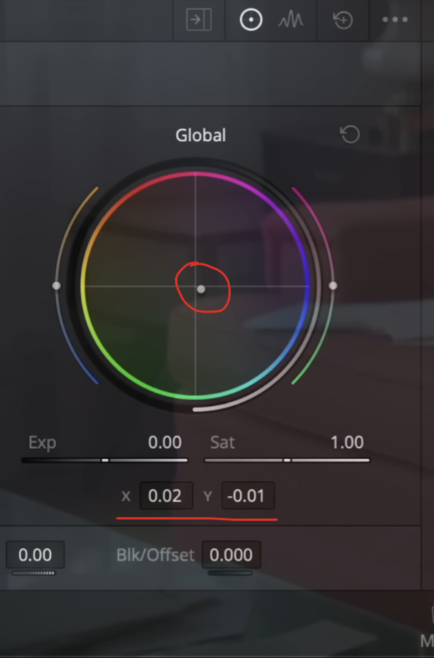
Now taking this, the first request from the client was to make the image neutral, which means to balance it out and that will create separation and vibrancy. Under my balance node, I am going to be using the HDR palette and the global option because the best thing about this tool compared to the normal offset, is that this doesn’t mess with the luma values.

The next thing I want to do is go to my look and here I am going to type in look designer. It’s a paid plug-in and I love it a lot. I feel like I use it on everything. When your first drop it on, it’s supposed to give you a rec.709 image, that’s why it’s double LUT-ing this.

So instead we are going to change both profiles to DaVinci WG.


Now it’s looking normal. And all I’m going to do is mess with the print options. Under contrast option I am going to select Kodak 2383. It created a nice luma separation, which gives us the illusion that there is color separation. If we were to park it here, we’d be good. We did most of the leg work to create the neutral image.

To take it a step further and under print stock, I am going to select Kodak Vision color print 2383.
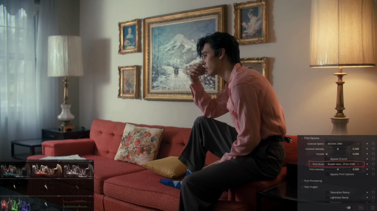
As soon as we do that, look at the amount of colors that came in. It gave us that separation which is the nature of this film stock.
Now the best part about this method compared to using the film LUTs in Resolve, is that the film LUTs are rec.709 so you can’t turn it into HDR if you wanted, but more importantly the LUTs are working with Cineon LOG, which is just not as clean as working in your scene-referred.
To top this all off, you can go to the bottom and actually export a LUT out of this.

So if you want to pass it on to an online editor working remotely, you can do this instead of them buying the plug-in.
One thing I remember the client said was not to push it too much. You can see the shadow detail is starting to become a bit lost, they are kind of getting crushed. So what I want to do is under my balance node, I want to go into the soft clip on my curves and bring up the low soft.


We did just enough without sacrificing the contrast that comes with 2383.
Now our last step is going to be a plug-in called Film Box. First when you drop it on, it will double LUT it again, so we need to change the parameters. We are going to select halation and grain only, and change the source.

Now under advanced settings I am going to leave it all on, but kill the saturation of the grain.

Just like that we are all done. Now none of this came at the cost of losing colors. We have so much color density and perfect contrast without losing anything, plus perfect color separation when it comes to the window light and lamp. Let’s compare the two grades.

As promised, we achieved our directive in the most natural way possible. With that, work hard, get obsessed and get possessed.